Monica Vinader

Remapping the customer’s digital journey

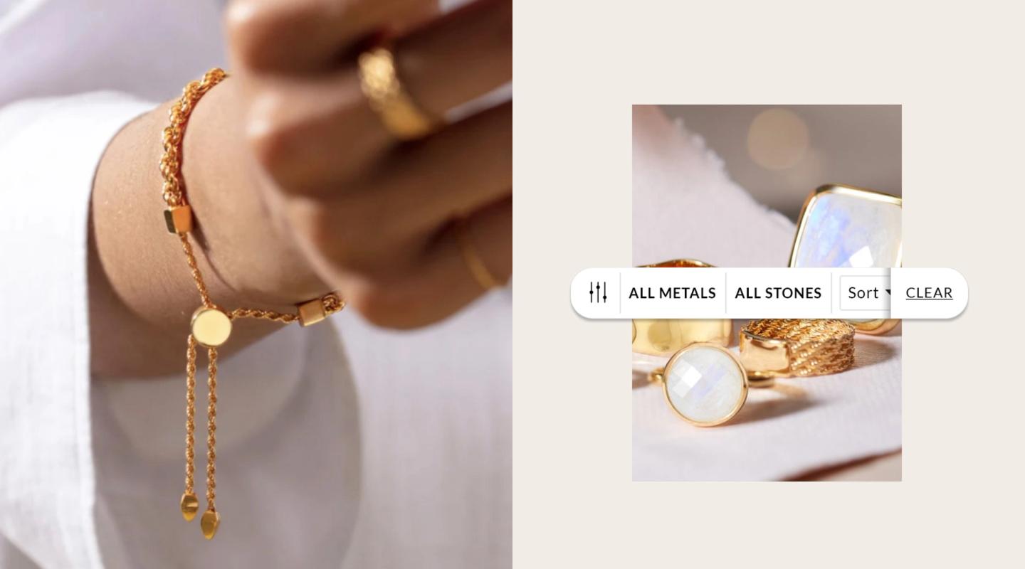
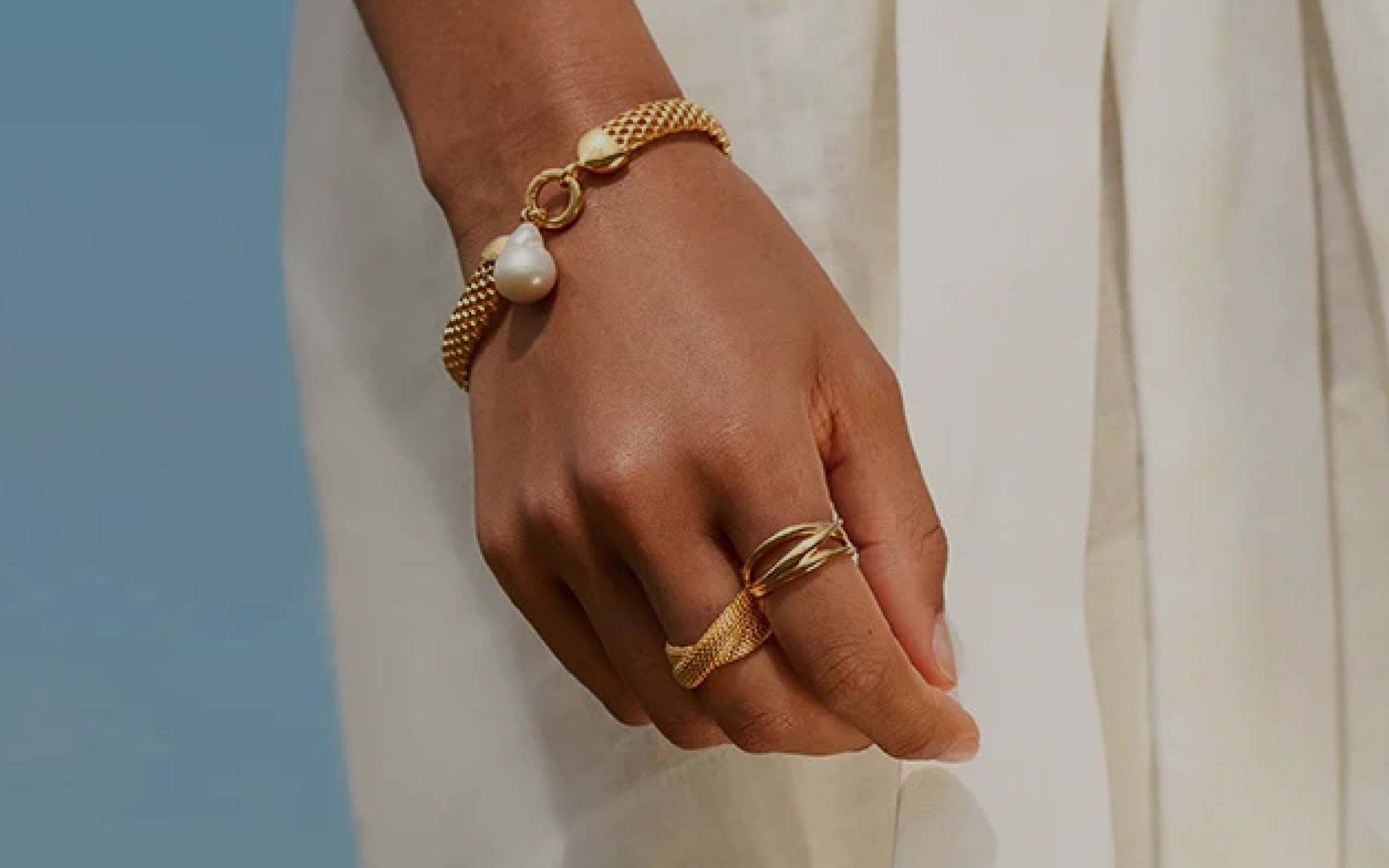
Women's hand wearing jewellery
  • UX
  • UI
  • Customer Experience
  • Creative Direction
  • Global Design System
monicavinader.com

Encapsulating luxury

Over the past 20 years, Monica Vinader has created jewellery that exemplifies accessible luxury. The secret to the brand’s continued success is to offer an exceptional range ‘touched by a thousand thumbs’. This sees gem cutters in Japan, master craftsmen in Thailand and Monica Vinader’s design team in Norfolk collaborating to craft demi-fine pieces of fashion jewellery.


Inevitably, it was only a matter of time before the luxury retail brand took its offerings online and launched the Monica Vinader website. However, the company soon realised its site was underperforming and needed to address three core challenges: How to increase ecommerce conversion rates, improve overall brand presentation and most importantly, properly capture the luxury of its jewellery range.
Célibataire's solution

Studio Célibataire was initially brought on board to focus solely on increasing conversion rates by refactoring the site’s checkout area. We simplified the customer’s ecommerce journey via a streamlined user interface – from order confirmation to delivery selection – resulting in better conversion rates across the board. Because of this successful outcome, Monica Vinader invited us to address the remaining challenges but with one key requirement: Any ecommerce UI or UX design plans must be implementable on the site’s ageing platform.

The first major redesign challenge focused on better managing and presenting the sheer breadth and depth of Monica Vinader’s inventory. While the brand offers only a small number of base designs, these are multiplied by a large range of metal, fibre and stone variations. On the existing site, this meant customers were forced to contend with long listing pages of very similar looking products, leading to a steep decline in engagement rates as users lost interest and browsed away.

To address this issue, we completely restructured and redesigned the product listings page. By introducing larger, more spaced-out product images with richer details coupled with picture-based filtering, the new design created a more engaging browsing experience as well as a more luxurious, meaningful presentation of Monica Vinader’s jewellery.

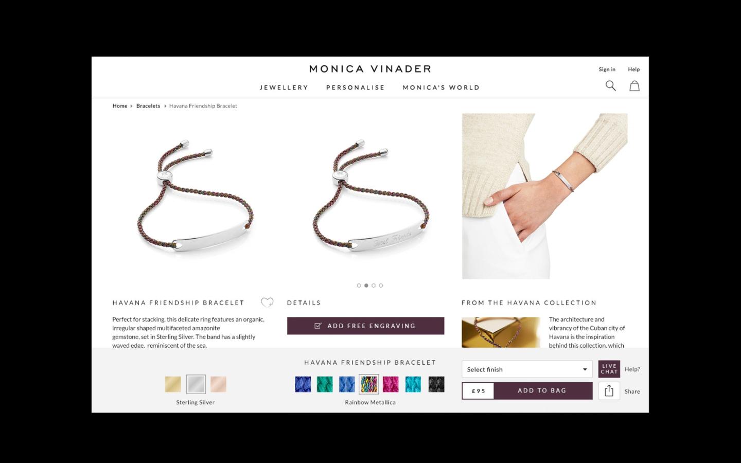
Monica Vindar Product Page UI Designs

With the macro view of products resolved, we turned to the ‘micro’: The product detail pages themselves. Our solution was to fashion a clear and immediate overview of the specific jewellery. This was complemented by intuitive controls at the top of the page for selecting variants and options.

With ‘above-the-fold’ content issues resolved, we then introduced a longer page structure beneath. This was designed to let customers quickly uncover a product’s unique story before finishing on general information about the luxury retail brand itself, creating a more complete user experience.

Monica Vinader jewellery on model
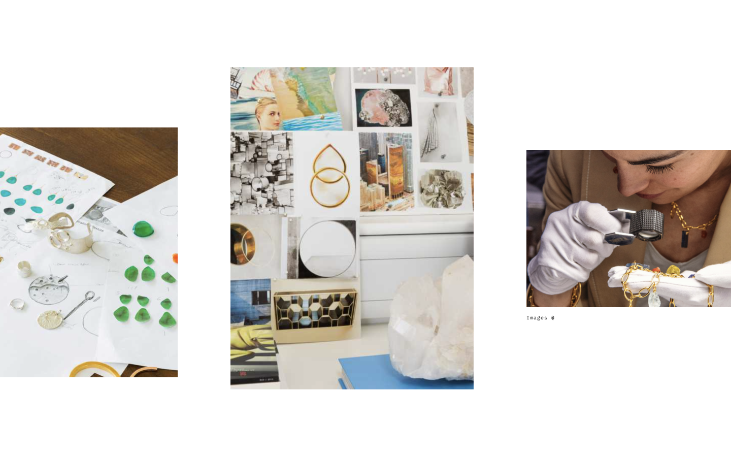
Jewellery design mood boards

The results

The platform-accommodating redesign has proved to be a hit with both customers and the client. Whereas the previous site often swamped customers with endless product pages, the repurposed digital experience is now more modern, accessible and focused. Importantly, the new layout is mobile-optimised, enabling consumers to enjoy the full Monica Vinader shopping experience whether at home or on the go.


The fresh look has also been praised for sweeping away the original site’s clutter and replacing it with large images and expertly curated content, all mated to a simplified ecommerce journey. Combined, Monica Vinader now offers a genuine digital-first retail experience that inspires customers to immerse themselves fully in the brand’s exquisite jewellery range.

Latest Insights

See more